Reading the Pull: How to Make Sense of a Tensegrity Drawing
Photo: Keyao Pan, Do-Nyun Kim, Fei Zhang, Matthew R. Adendorff, Hao Yan, and Mark Bathe, CC BY 4.0, via Wikimedia Commons
Tensegrity diagrams have a reputation problem. They look like someone tried to draw a bicycle wheel from memory, then added arrows. But a good diagram is not a picture of a shape; it is a map of forces. Once you know what the lines are doing, the panic fades. This guide is for UK students, makers and design enthusiasts who want to read those maps without pretending they already understand them.
Start with the jobs, not the lines
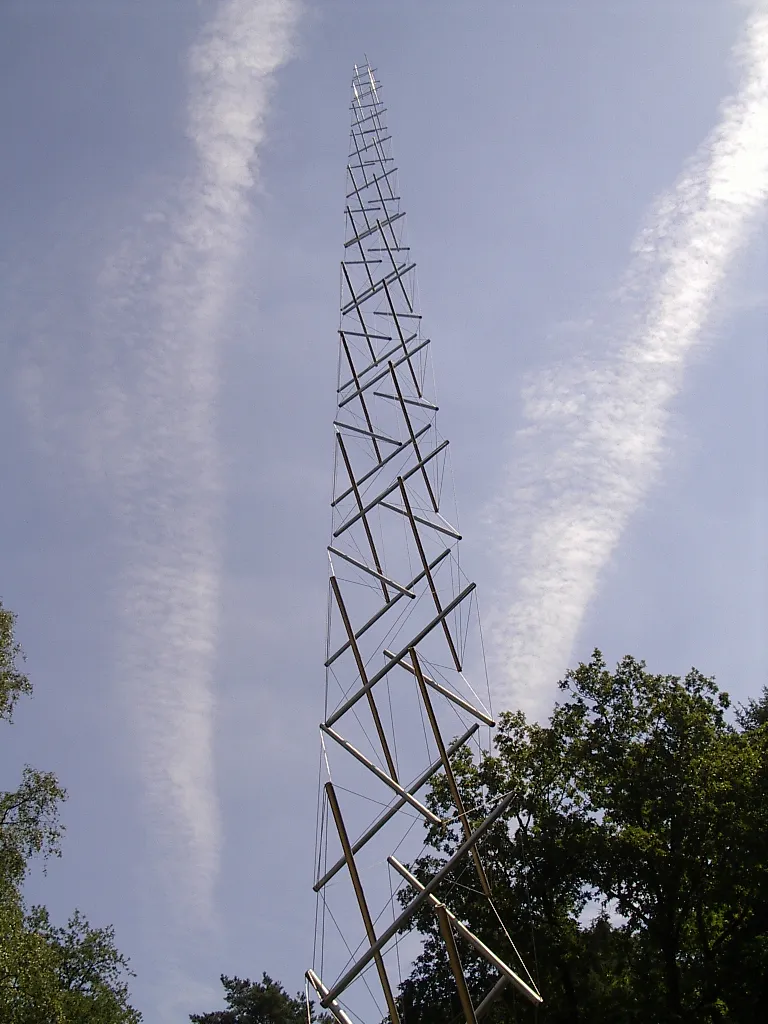
In a tensegrity structure, some members push and some pull. The pushy ones are compression members, usually called struts. The pullers are tension members: cables, tendons, cords or sometimes chains. The classic tensegrity trick is that the struts do not touch each other. They float in a continuous network of tension. The compression is discontinuous; the tension is continuous.
That single idea is the key to most diagrams. Do not begin by asking what shape it is. Ask which parts are pushing and which are pulling. A line on a page might be a strut, a cable, a shadow, a leader line for a label, or a fold in the paper. The caption should tell you. If it does not, the diagram is already asking for trouble.
Trace two paths with a pencil
Take a pencil and shade every strut. Then use a second colour to trace the cables. You are looking for two different stories. The compression story is broken: one strut, then a gap, then another strut. The tension story should be continuous: cable to node, node to cable, all the way around.
Next, ask two rude questions. If I cut this cable, what moves? If I remove this strut, what collapses? These are not destructive questions; they are reading questions. They force you to decide whether a line is structural or decorative. A cable that can be slackened without changing the shape is probably not doing much. A strut that is secretly bolted to a hidden frame is not floating at all.
Why good diagrams look wrong at first
Most of us are trained to read structures from the ground up. A wall sits on a foundation; a beam sits on a wall; a roof sits on a beam. Tensegrity often works the other way around. The structure may hang from its tension network, and the struts may appear to be held in mid-air. That looks wrong because our eyes expect support to come from below.
Perspective causes more confusion. In a two-dimensional drawing, two lines can cross without touching. In a real tensegrity, a cable might pass in front of a strut, or two cables might meet at a node while a strut ends nearby. If the drawing does not mark those crossings clearly, your brain fills in the wrong connections. A good diagram uses dots, breaks in lines, or small perspective cues to say what meets what. A bad one leaves you guessing.
There is also the problem of the word ‘floating’. In a tensegrity model, nothing is floating in the sense of being weightless. The members are in equilibrium. The top part is held by cables that are pulling against struts that are pushing. It is a balance of forces, not a suspension of physics.
Three sketches to make in your notebook
Sketch 1 — the classic three-strut prism. Draw three thick arrows, one for each strut, pointing along the member. Label them compression. Draw a continuous loop of thin lines around the ends, plus cross-lines between the ends. Label the loop tension network. Put a circle at one junction and label it node: cables meet here; strut ends do not touch. Add a warning note: if the struts touch, this is not the same diagram.
Sketch 2 — the almost-tensegrity table. Draw a tabletop held by four diagonal cables and a central post. Make the post touch both the top and the floor. Label it hidden compression path. This is a useful sketch because it shows how a familiar object can look tensegrity-ish while relying on a rigid column. Many maker plans do exactly this, sometimes by accident.
Sketch 3 — the exhibition-label map. Draw a rough outline of the work as you see it. Then add arrows for load paths: down through the struts, around through the cables, into the anchors. Label the anchors at the floor or ceiling. If you cannot find the anchors, write that down. It is a real observation, not a failure.
A checklist for textbook figures and gallery labels
Use this when you are staring at a figure in a textbook, a plan on a maker forum, or a label in a design exhibition.
- Are the compression members separate? Do any struts touch each other, or touch a frame that is not labelled?
- Can you trace a continuous tension network? If the cables stop at a rigid joint, what is that joint doing?
- Are crossings marked? In the drawing, do crossing lines meet at a node, or just pass in front of each other?
- Does the caption use words such as prestress, self-stress or tension network? If not, it may be a hanging model rather than a true tensegrity.
- Are the supports shown? External anchors are allowed, but they should be part of the explanation.
- Does the label claim ‘floating’ without saying what holds the work up? Treat that as a prompt to look harder, not a fact.
- Is the scale clear? A thin line might be a steel cable, a nylon cord or a rigid rod. The diagram should say which.
- Does the plan include adjustment? Real cables stretch, knots slip and timber shrinks. Turnbuckles or tensioners are a sign that someone has thought about assembly.
Common mistakes in maker plans
The first mistake is treating cable as decoration. If the cord is slack, it is not prestressed, and the structure will wobble. The second is letting struts touch at a joint and calling it tensegrity anyway. It may be a perfectly good structure, but it is not the same structural idea.
Other frequent problems include using elastic cord where low-stretch cable is needed, hiding a central support, and copying a diagram without checking whether the top and bottom are mirror images. Knots are another quiet failure point: a simple reef knot may hold for a tabletop model and slip under load in a larger piece. Plans that do not show node details are often plans that have not been built.
Finally, be wary of line weight. A thick line does not always mean compression, and a thin line does not always mean tension. Read the labels, the legend and the notes. If there are none, the diagram is not finished.
A five-minute reading routine
Cover the caption. Mark the struts. Trace the cables. Find the anchors. Ask the cut-and-remove questions. Check the label for prestress and supports. Look for a hidden frame. Then uncover the caption and see whether it agrees with you.
Diagrams are arguments about how a structure works. You are allowed to argue back. If a drawing cannot show you a load path, that is useful information: the drawing, not you, is the problem.